What is a Wireframe in UX Design?
A wireframe in UX/UI design is the blueprint of your digital product. It’s the bare-bones structure that helps you visualize how a website or app will look and function before getting into the details.
So, what is a wireframe in UX design exactly? It’s like creating a map for your project, helping designers and developers organize the layout and user flow without getting distracted by colors or images. Think of it as laying down the foundation before building the house, it makes the rest of the design process smoother and more effective, right?
Types of Wireframes in UX Design:
Here are the most common types of wireframes in ux/ui design

Low-Fidelity Wireframes:
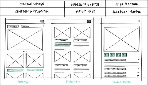
Low-fidelity wireframes are the simple sketches or basic layouts that give a rough idea of how a page or screen will look. These wireframes usually consist of basic shapes like rectangles and lines to represent different elements like buttons, navigation bars, and content areas. The goal is not to focus on the design details but to visualize the layout and structure. Think of it as the outline of a story, just enough to get the key points without all the details.

When Low-Fidelity Wireframes Used?
Low-fidelity wireframes are used early in the design process when the goal is to quickly communicate ideas and test out concepts. These wireframes are perfect for brainstorming sessions or when you need feedback before committing to more detailed designs. Since they’re quick and easy to create, they help designers focus on functionality and layout without getting distracted by colors, typography, or images. They’re an excellent way to validate ideas before diving deeper into a wireframe in UX/UI design.
Mid-Fidelity Wireframes:
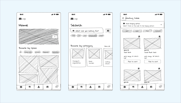
Mid-fidelity wireframes offer more detail than low-fidelity wireframes but are still fairly simple compared to high-fidelity ones. These wireframes usually include more refined shapes, basic typography, and clearer layout placement.
You might see buttons, placeholders for images, and actual text in these wireframes, helping you visualize how content will be arranged. It’s the sweet spot between sketching and fully detailed design, allowing you to focus on structure without getting too caught up in the visual design yet.

When Mid-Fidelity Wireframes Used?
Mid-fidelity wireframes are used when you want to test and refine the structure and flow of your design before going all in on the final details. They’re great for making decisions about layout, content hierarchy, and functionality. Mid-fidelity wireframes help designers ensure that the user experience is coming together, while still keeping things simple enough to make changes. These are ideal for when you’re further along in the process and need something more concrete than low-fidelity wireframes but aren’t ready for the final polish. When following wireframe best practices, these wireframes allow for useful feedback on how users will interact with the interface.
High-Fidelity Wireframes:
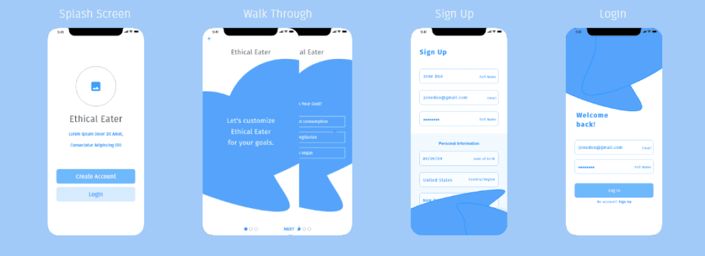
High-fidelity wireframes are the detailed versions of wireframes, closely resembling the final design of a website or app. These wireframes include specific design elements like typography, colors, images, and sometimes even interactive features. At this stage, the layout is almost set in stone, and these wireframes are meant to show exactly how each element will function and look on the screen. Think of them as the final draft before you begin building the actual product.

Source: www.media.pixelfridge.digital
When High-Fidelity Wireframes Used?
High-fidelity wireframes are used later in the design process when you have a solid idea of the layout and functionality, and you want to see how everything will look in its final form. They’re perfect for presenting to stakeholders, getting feedback on visual design, or creating a more interactive experience for user testing. At this stage, you’ve already figured out the overall structure and flow, so high-fidelity wireframes help you focus on the finer details. Why wireframing is important becomes evident here, as it allows you to test how the actual design will feel in the hands of users without needing to build a fully functional product right away. These wireframes help prevent costly mistakes by showing exactly how things will work and look before coding begins.
Interactive Wireframes:
Interactive wireframes take the concept of traditional wireframes to the next level by adding interactivity. These wireframes allow you to simulate user actions, like clicking buttons, navigating menus, or interacting with elements on the page. While they may still be basic in design, the focus is on showing how users will engage with the interface. Interactive wireframes help you test functionality and user flow, giving a more realistic feel for how the final product will behave.
When Are Interactive Wireframes Used?
Interactive wireframes are used when you want to test the functionality and flow of your design, especially before committing to complex interactions. These wireframes are perfect for prototyping and usability testing, allowing you to see how users interact with your design in real-time. They’re great for understanding how the visual hierarchy in wireframes will influence the user experience.
Annotated Wireframes:
Annotated wireframes are wireframes that include detailed notes and explanations alongside the visual elements. These notes can explain the purpose of certain features, interactions, or content placement.
Essentially, annotated wireframes serve as a guide, making it easier for everyone involved in the design process, designers, developers, and stakeholders, to understand the rationale behind each design decision. These wireframes help communicate ideas clearly and ensure that everyone is on the same page.
When Are Annotated Wireframes Used?
Annotated wireframes are used when you need to provide more context or explanation for your design choices. They’re especially helpful when working with a team, as they clarify specific elements, functionality, and any considerations for how the design will change. If you’re working on a wireframe in UX/UI design with other team members or clients, annotated wireframes help ensure that everyone understands why certain decisions were made. They’re also useful for explaining more complex designs or when you need to communicate the intent behind certain features. Annotated wireframes are an essential part of the types of wireframes in UX/UI design, especially when the goal is to ensure a smooth handoff from design to development.
Responsive Wireframes:
Responsive wireframes are designed to show how a website or app layout will adjust across different screen sizes and devices. These wireframes focus on flexibility, ensuring that the design works seamlessly on desktops, tablets, and smartphones. The goal of responsive wireframes is to ensure that users have a smooth and consistent experience no matter what device they’re using.
When Are Responsive Wireframes Used?
Responsive wireframes are used when you need to design for multiple devices and screen sizes. They are essential in the early stages of a project, helping you visualize how content and elements will adapt to different screens. If you’re working on a wireframe in UX/UI design that must be accessible and usable on a variety of devices, responsive wireframes will guide you in creating flexible layouts. These wireframes are part of the types of wireframes in UX/UI design that ensure a design is mobile-friendly and responsive, providing users with a consistent experience regardless of the device they’re using.
Benefits of Wireframing in UX Design:
| Benefit | Explanation |
| Clarity and Focus | Wireframes provide a clear roadmap for the design process, helping teams stay focused on structure and functionality. |
| Early Problem Detection | They allow you to spot usability issues or design flaws early in the process, saving time and resources later. |
| Better Communication | Wireframes help communicate ideas clearly among team members and stakeholders, ensuring everyone is aligned. |
| Cost-Effective | Creating wireframes is cost-effective as it helps avoid expensive design changes later in the development process. |
Also Read: What is Mobile App Development Framework?
Best Practices for Creating Wireframes:
| Best Practice | Explanation |
| Keep It Simple | Focus on layout and functionality without getting bogged down in design details. |
| Use Consistent Elements | Ensure that UI elements are used consistently to avoid confusion during the design process. |
| Prioritize User Flow | Always keep the user experience in mind, ensuring intuitive navigation and interactions. |
| Iterate and Test | Regularly test your wireframes and make adjustments based on feedback to improve usability. |
Common Mistakes to Avoid in Wireframing:
| Mistake | Explanation |
| Overcomplicating Designs | Adding unnecessary details can distract from the main structure and confuse stakeholders. |
| Ignoring Responsiveness | Not considering how the design will adapt to different devices can lead to poor user experiences. |
| Lack of Annotations | Not including enough explanations or notes can make it hard for team members to understand the rationale behind design choices. |
| Skipping User Testing | Failing to test wireframes with real users can lead to missed usability issues that affect the final product. |
Conclusion:
So, what is a wireframe in UX design? It’s a simple blueprint for your website or app that shows how things will work, without worrying about colors or details. Why wireframing is important is simple: it helps you catch issues early, saves time, and makes sure everyone understands the design. From types of wireframe in UX/UI design, each style helps at different stages of your project. Whether you’re starting with rough sketches or getting into the final design, wireframes keep things clear and make sure your user experience is smooth.


